

This project was indeed one long and tiring journey. the most challenging was the photography for the project, mainly because I had no idea, how I wanted my models to look like as they modeled.It took me 2 days in just figuring out what my pictures should look like and how i can convey a message through my pictures.After taking the perfect pictures with the help of my friend neha and fawad i was finally ready to start the designing but the designing itself was a bigger mountain to climb.Despite having a general idea of what I wanted designing the magazine and choosing the perfect layout took a lot of time However, I managed to push through and here it is.
Cover Page

name:
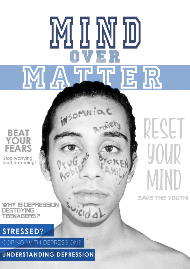
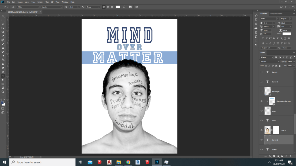
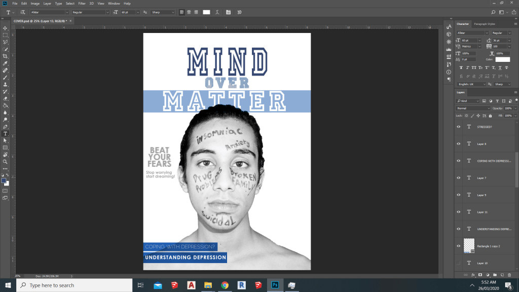
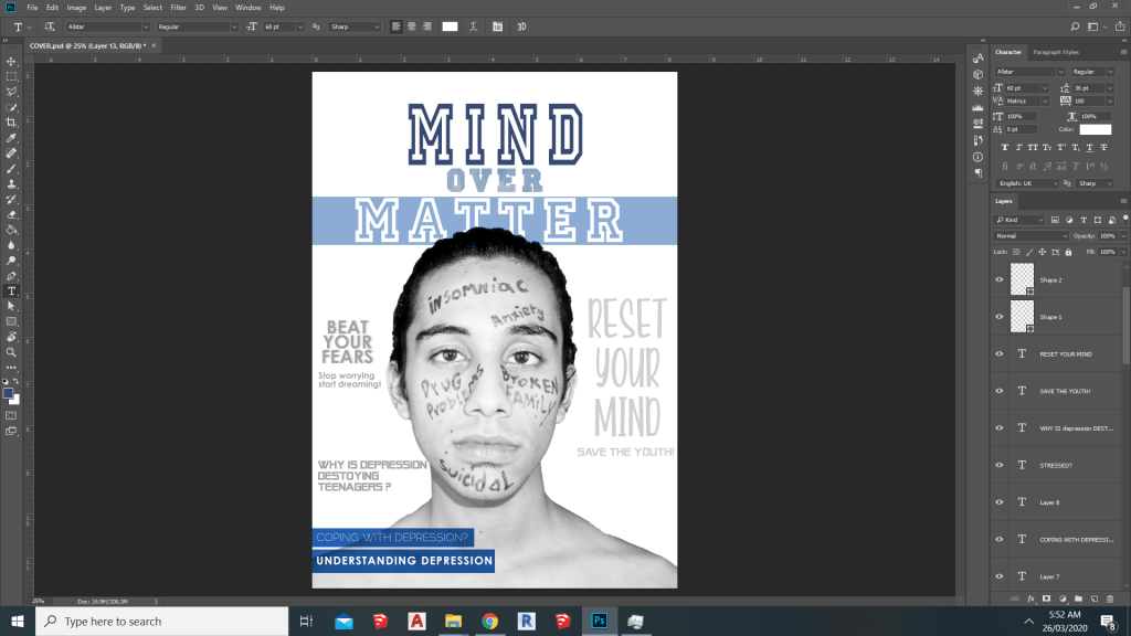
Well from the very beginning i had the basic what my cover would look like,but i wasn’t really sure that what i should name my magazine and i at first i considered naming my magazine “Human psyche” but it wasn’t justifying magazine so my i ended up naming my magazine “Mind Over Matter” which means using your brain and will power to overcome problems which i thought would be perfect according to my genre.
CONCEPT:
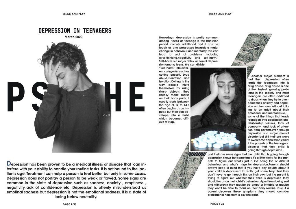
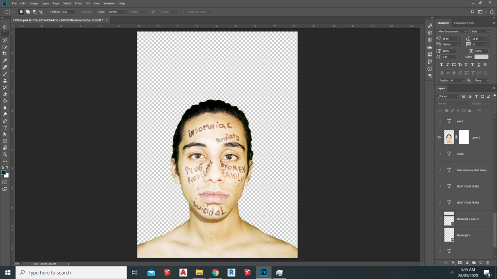
The main idea behind the cover was to show a teen that is going through depression and that showcases the physical and and emotional problems problems that a mental illness such as depression can cause and the consequences one can face due to depression.
COLOR SCHEME & LAYOUT:
At first i wasn’t sure about my color scheme but the one thing that i was pretty sure about was my layout so while trying to find the perfect color scheme for my magazine i went through a lot of different color schemes and fonts.
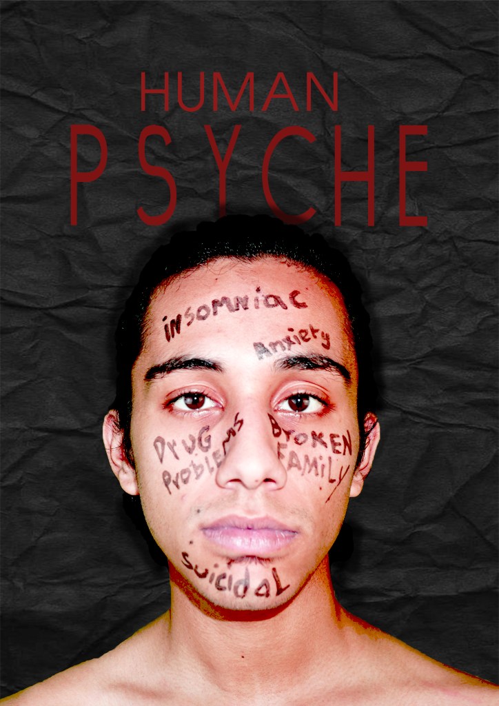
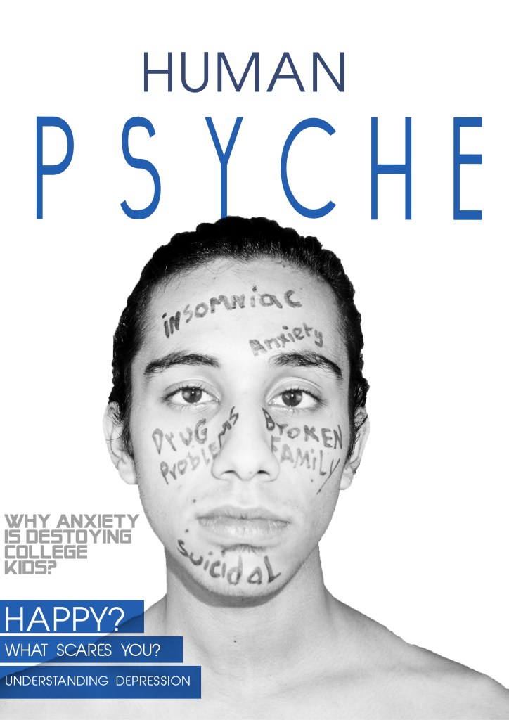
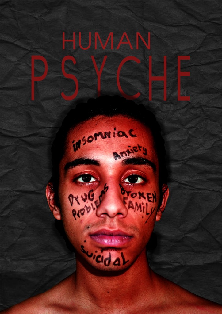
These are the few covers i made before coming up with my final cover:
Editing:
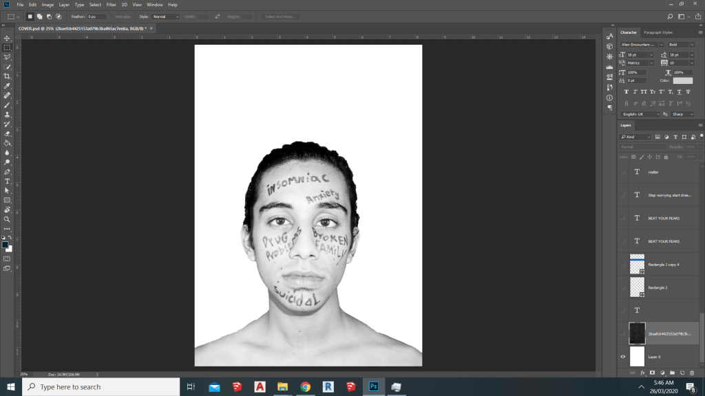
So in the cover i simply removed the background of the picture using the quick selection tool and changed the adjustments to black and white then i added some block that highlights the text and finally i added my side text.
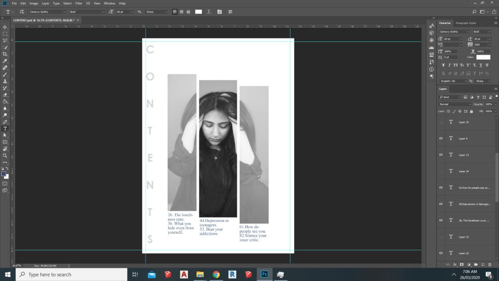
Content Page:
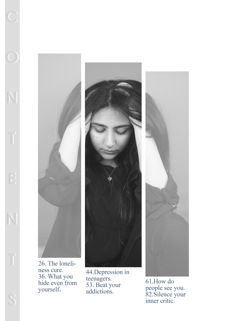
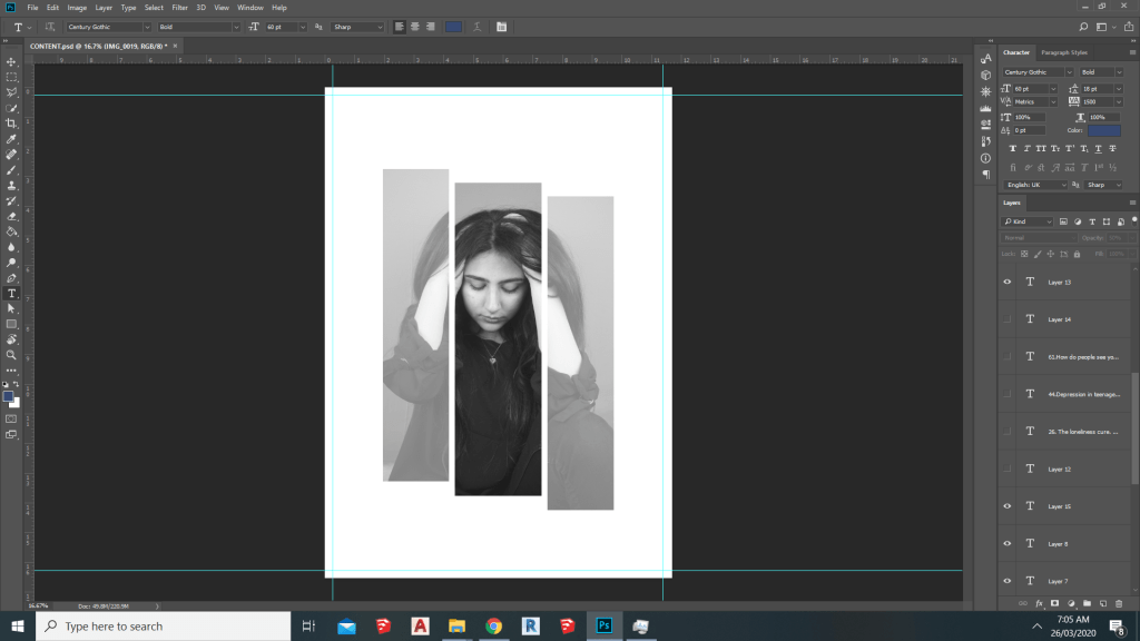
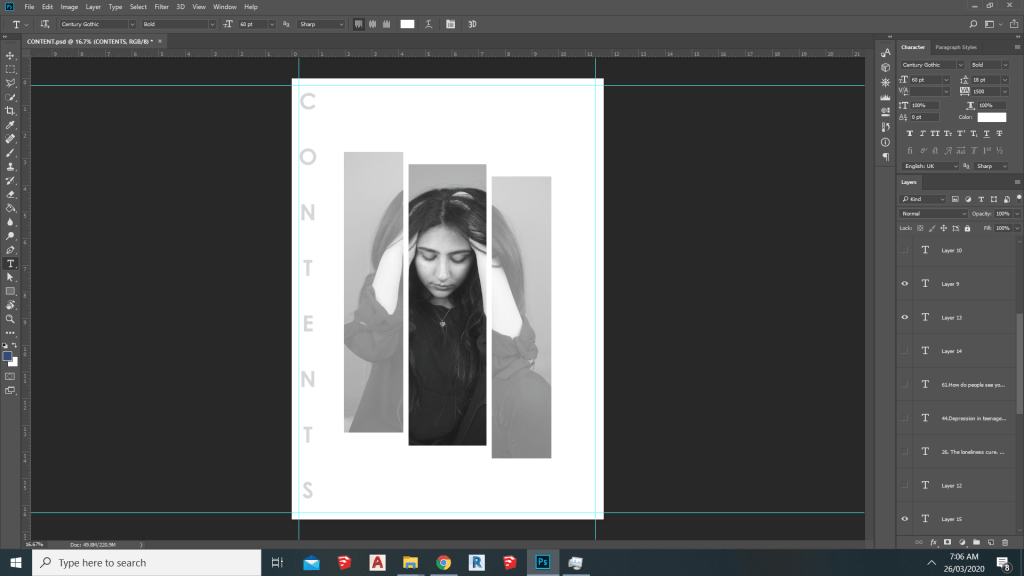
what i did in my content page is that i divide the picture in three parts and reduced the opacity for two parts which gave it a faded look and highlighted the models face and expressions which represent distress than i added the contents for the magazine
Progress through this project:
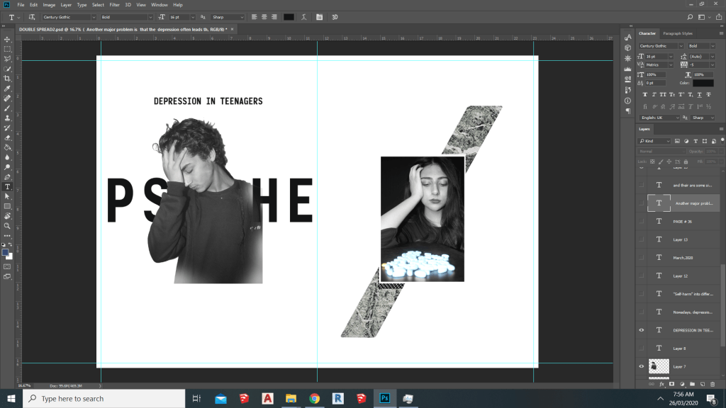
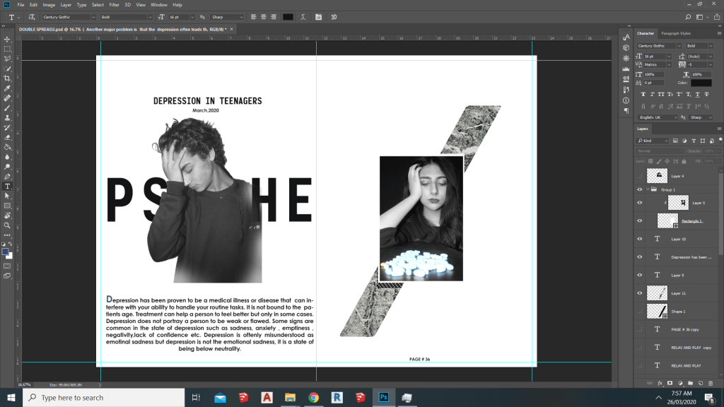
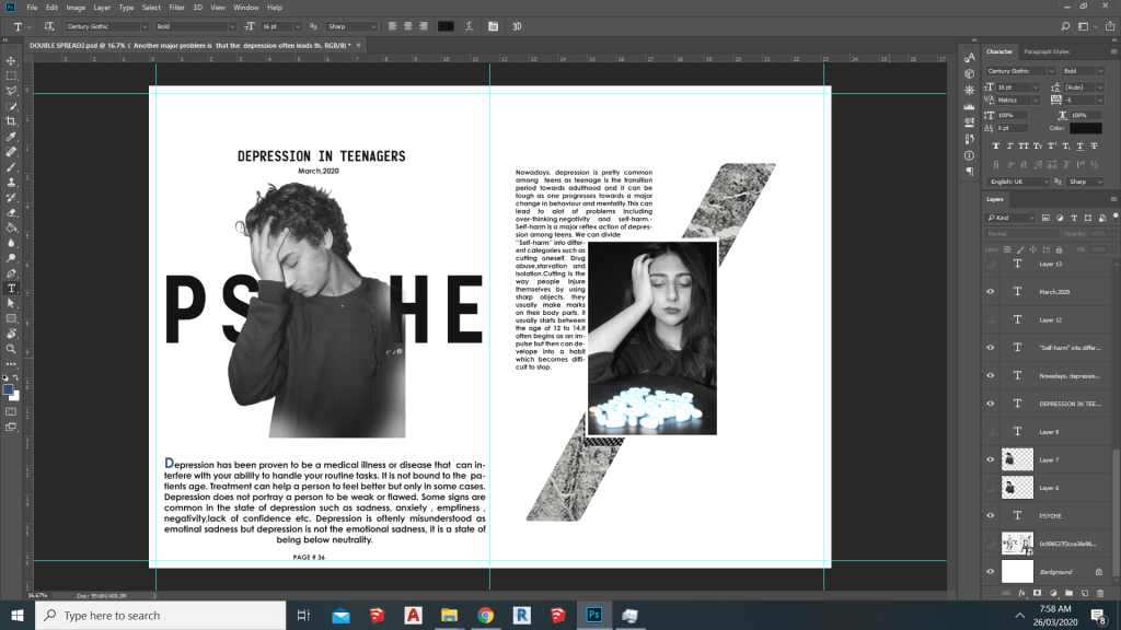
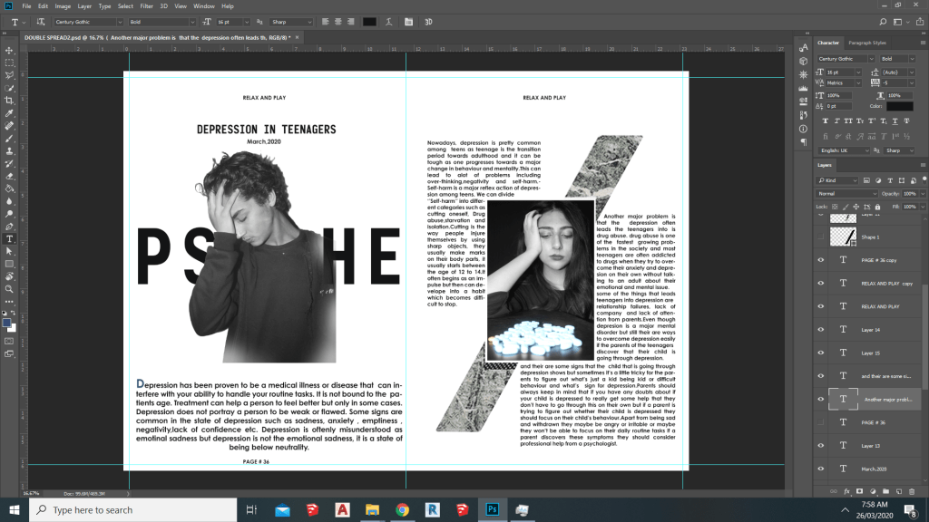
Double Spread:
unlike the cover and content page i had no idea for the double spread’s layout,but after i started working on the double spread i finally came up with the basic idea of what my double spread should look like.
In the double spread i wrote about depression in teenagers,why teenagers face depression and how teenage depression leads teenagers to self harm and drug abuse.